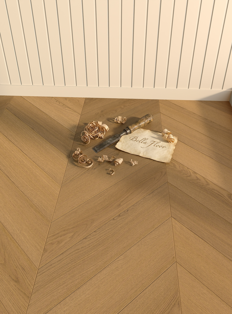
Herringbone and Chevron are both directional geometric patterns, but their joint logic is different. The right choice depends on the room scale, desired rhythm, border strategy and the exact installation system available.
Pattern is an architectural decision
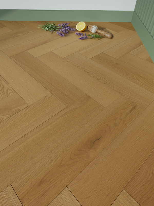
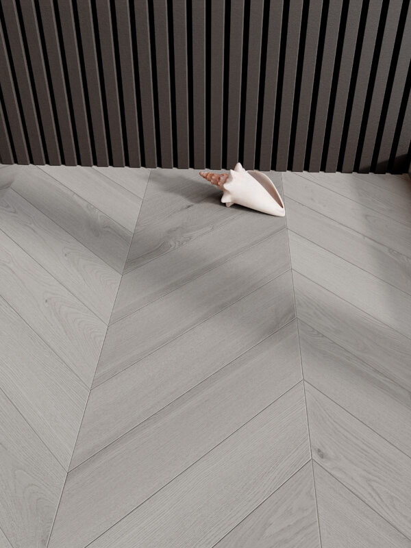
Herringbone creates a woven, interrupted rhythm because the ends meet at alternating right angles. Chevron creates a continuous V that draws the eye along a sharper central axis. Both can be expressive; neither should be selected from a small screen image alone.
The broken directional change gives rooms a crafted, layered movement.
The aligned points produce a more graphic and architectural visual field.
Doorways, borders and transitions influence the pattern more than the sample suggests.
Board length, width and colour contrast should be judged against the room proportion.
Herringbone and Chevron are both directional wood-floor patterns, but they create different rhythms in a room. The decision should begin with the intended movement of the space rather than with colour alone.
Herringbone: a broken, repeated rhythm
Herringbone places rectangular elements at right angles. The resulting pattern has a familiar, layered character that can give an interior a strong sense of texture. It works especially well when the floor is intended to be a visible part of the room composition.
Chevron: a continuous direction
Chevron pieces meet at an angle to form a continuous point. This creates a more linear visual flow and can help draw the eye along the length of a space. Room proportion, sightlines and furniture layout should guide the final direction of the pattern.
Choose with a sample and layout
Review the product reference and possible layout before specification. Explore Roma Herringbone and Roma Chevron to compare the available decors and product details.
How the two patterns change a room
Pattern direction affects how an interior is read from the entry, along a corridor and across an open room. Herringbone breaks the surface into a repeated zig-zag rhythm. Chevron forms a continuous V, so it gives a clearer directional line. Both can be quiet or expressive depending on the selected tone, the scale of the element and the room light.
Use sightlines deliberately
Before fixing the direction, stand at the main entry point and trace the longest visual line in the room. A pattern that follows this line can lengthen the perceived space; one that crosses it can add a stronger graphic moment. Doorways, transitions and furniture placement should be considered at the same time.
Specification checklist
- Confirm the exact left/right or format requirements for the selected pattern.
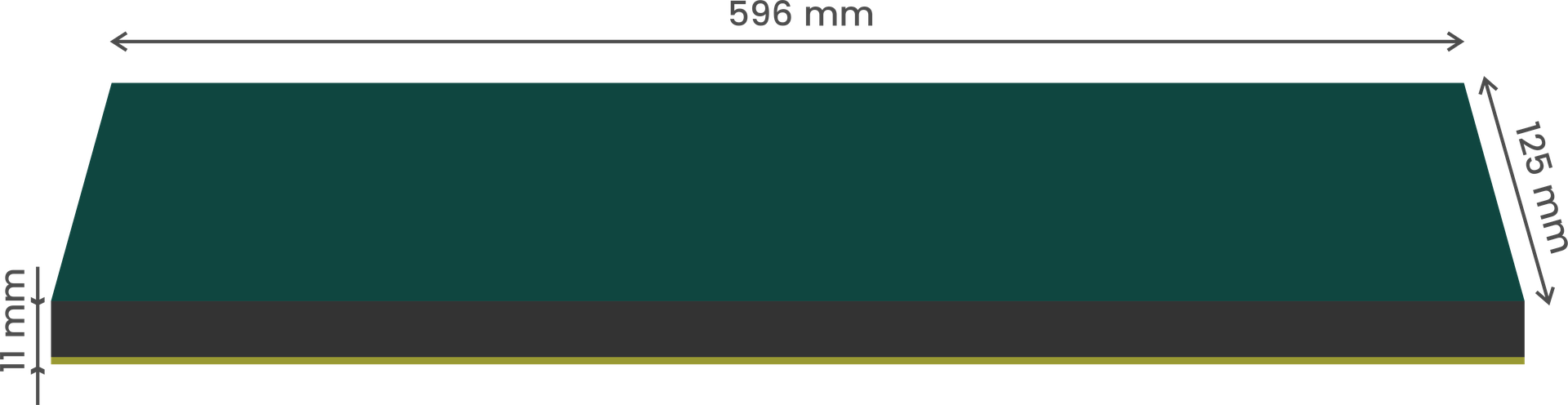
- Review the listed dimensions and package information for that reference.
- Approve a layout sample before full installation.
Frequently asked questions
Is one pattern better for small rooms?
Neither pattern is automatically better. The scale, direction and amount of visible floor are more important than the name of the pattern.
Can the same colour look different in Herringbone and Chevron?
Yes. The angle and repetition of the pieces change how light meets the surface and how the grain is perceived.
Project note: make the layout visible early
Ask for the proposed start line, pattern direction and treatment at thresholds before work begins. A small drawing or dry-layout discussion can resolve decisions that are difficult to change once the pattern is installed. This is particularly valuable where several rooms meet or where the floor continues into a prominent entrance area.
Choose the pattern with the room plan open
Test the pattern direction against the main sightline, daylight and the location of furniture. The pattern should support circulation and proportion, not fight the architecture.
A project-ready selection checklist
Frequently asked questions
What is the visual difference between Herringbone and Chevron?
Herringbone changes direction with a staggered joint, while Chevron creates aligned points and a continuous V.
Does the pattern work in every room size?
Both can work, but board scale, border detailing and colour contrast should be proportioned to the room.
Explore Bella Floor collections
Review the available pattern directions and connect the visual choice to the technical reference.