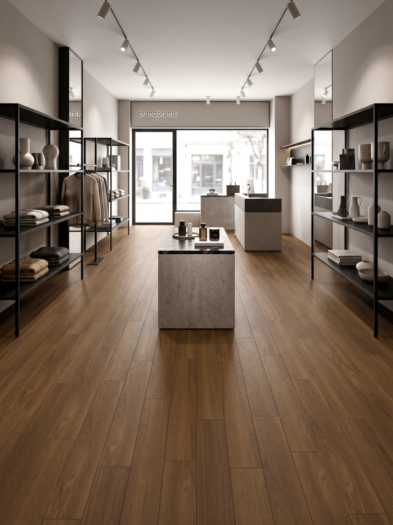
Oak, walnut and natural tones do more than set a colour. Species character, grain movement, contrast and light response influence the atmosphere and perceived scale of an interior.
Build a palette around grain, not colour alone
A convincing flooring palette begins with the way the surface catches light. Oak can move from quiet and pale to expressive and smoked; walnut introduces depth and warmth; natural tones create a bridge between architecture, furniture and textiles.
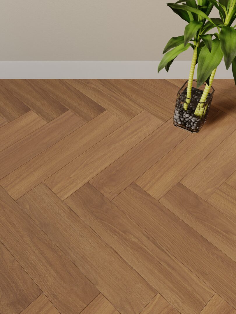
A broad range of grain, tone and format makes oak adaptable across residential and contract interiors.
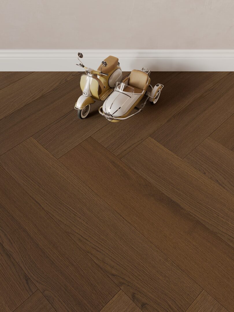
Darker brown tones add visual weight and pair naturally with stone, metal and soft neutrals.
The same sample can read differently in daylight, warm artificial light and side light.
Use the floor as the base note and let joinery, walls and textiles complete the palette.
A wood floor is often one of the largest continuous surfaces in an interior, so its tone has a lasting effect on the overall palette. Start with the atmosphere the project needs to create, then examine the floor alongside the materials that will remain in place.
Oak: flexible and familiar
Oak can support light, neutral or deeper interior directions depending on the selected reference. It is useful when the floor should connect easily with a wider mix of finishes and furnishings.
Walnut: depth and contrast
Walnut introduces a richer visual weight. It can become a strong counterpoint to pale walls and mineral surfaces, or a quieter layer within a darker, more enveloping palette.
Make the final choice in context
Review samples under the intended light and beside the key materials in the room. Explore the Sense collection for oak and walnut directions, and the Family engineered wood collection for additional material choices.
Build a palette from the permanent materials
A floor sits beside paint, stone, metal, upholstery and timber joinery for many years. Instead of selecting a tone in isolation, gather the samples that will remain in the room and evaluate them together. The aim is to understand contrast, warmth and visual weight before the final reference is approved.
Light changes perceived colour
Morning, afternoon and artificial light can reveal different aspects of the same surface. View samples horizontally and vertically, near a window and deeper inside the room. A tone that appears neutral on a small sample may feel warmer or cooler over a full floor area.
A simple palette checklist
- Choose the dominant material and two supporting materials.
- Decide whether the floor should blend in or create contrast.
- Compare samples under the project lighting before confirming the code.
Frequently asked questions
Should all wood tones match exactly?
No. Related tones can create depth. What matters is that the temperature and contrast are intentional.
Is a natural tone always lighter?
No. Natural describes a visual direction, not a fixed brightness. Always review the actual reference.
Project note: approve the palette as a group
A final floor sample should not be approved alone. Place it beside the selected wall colour, fabric or upholstery, stone and main timber finish. Photograph the group in the project light and keep it with the finish schedule so the original colour relationship remains clear during procurement.
Let the floor anchor the material palette
Place the sample beside wall paint, stone, metal, timber and key textiles. The most successful palette is not the one with the strongest single colour; it is the one that remains coherent as light changes.
A project-ready selection checklist
Frequently asked questions
Is oak more versatile than walnut?
Oak usually offers a wider range of tones and visual directions, while walnut can provide stronger depth. The right choice depends on the palette and atmosphere.
Why does the same floor look different in photos?
Light direction, white balance, surrounding finishes and screen settings all affect the perceived colour. Approve a physical sample.
Explore Bella Floor collections
Use real samples and collection references to build a flooring palette that holds together across the project.